Showing posts with label illustration. Show all posts

December 30, 2014

my pet bear, ain't no thing

The we heart collective has made a calender for 2015 which you can download for free here.

We each created an artwork for an allocated month – I got July. The mental process pretty quickly went from July – winter – snow – mountains – ooooh lets draw a bear. lol, you can bet that if I get to choose the subject matter for a drawing, there is going to be an animal of some kind included (and most likely winter as well if I can).
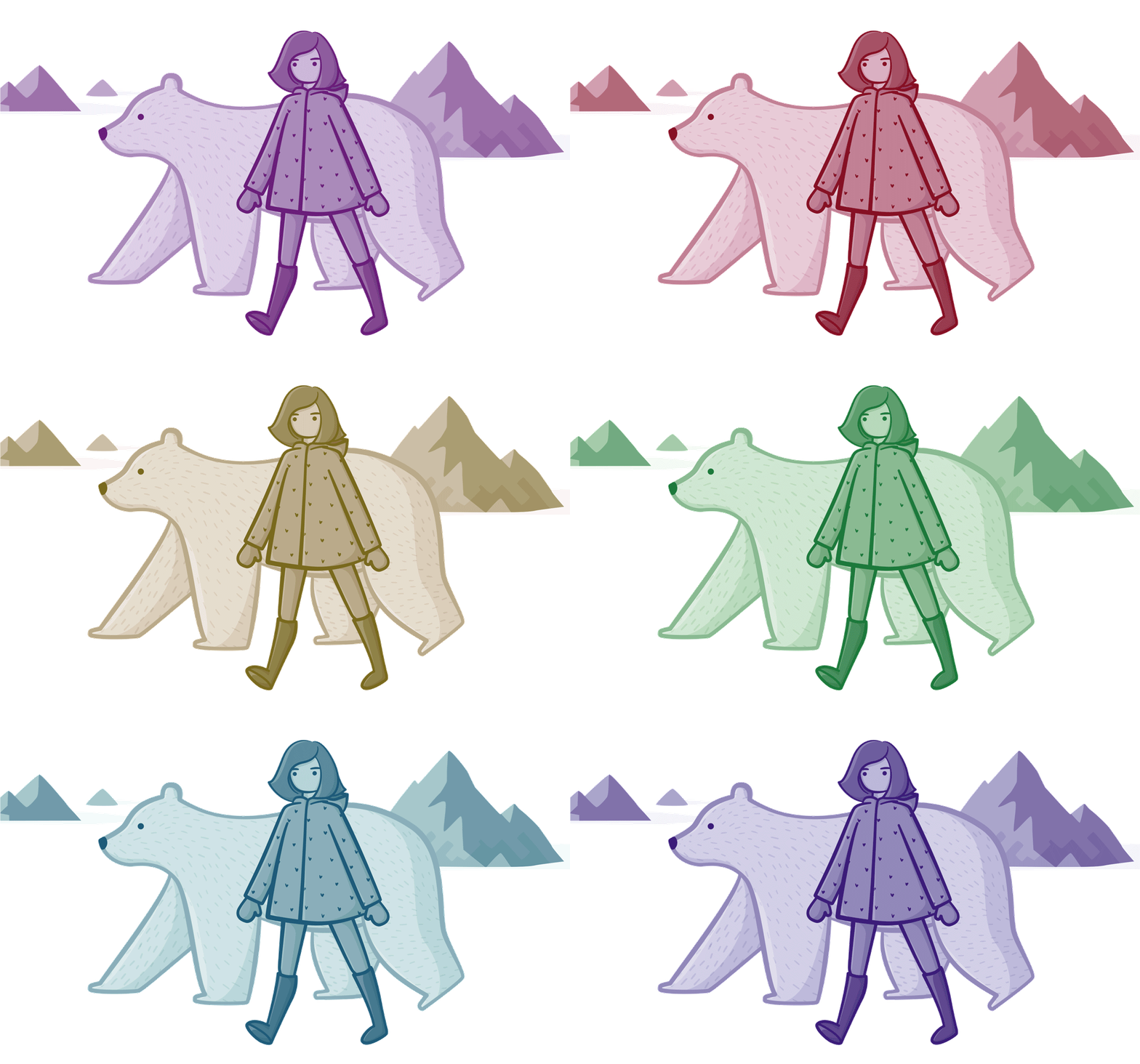
To try something new, I made this particular drawing using only one colour (which makes for a nice effect), but the problem was deciding WHICH colour. I must have changed it 20 times during the final hour. It ended up being purple.

July 28, 2014

understanding cats


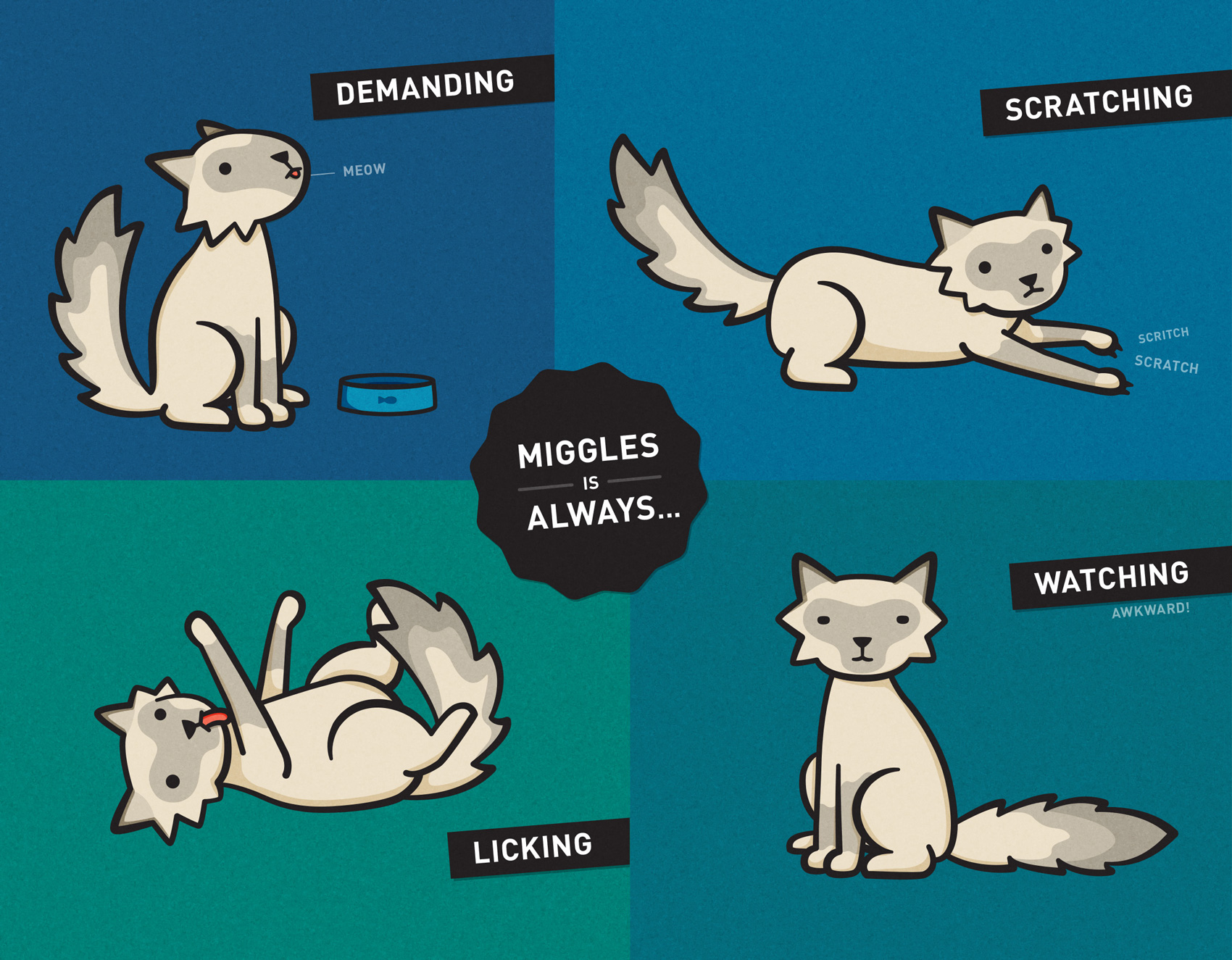
a quick glimpse at my folio would quickly tell you that I LOVE drawing animals, including many cats. Having grown up with dogs, I've always been a bit fascinated by cats – the mysterious 'other' pet. I will admit that I know nothing about cats, until recently. A friend I have been spending a heap of time with lately has one and it turns out they aren't really anything like what I thought – ie. nothing like dogs. ha, obvious statement now I know!

Here is something I drew about this particular cat, its most common behaviour and the struggle of drawing an epically fluffy creature.

June 07, 2014

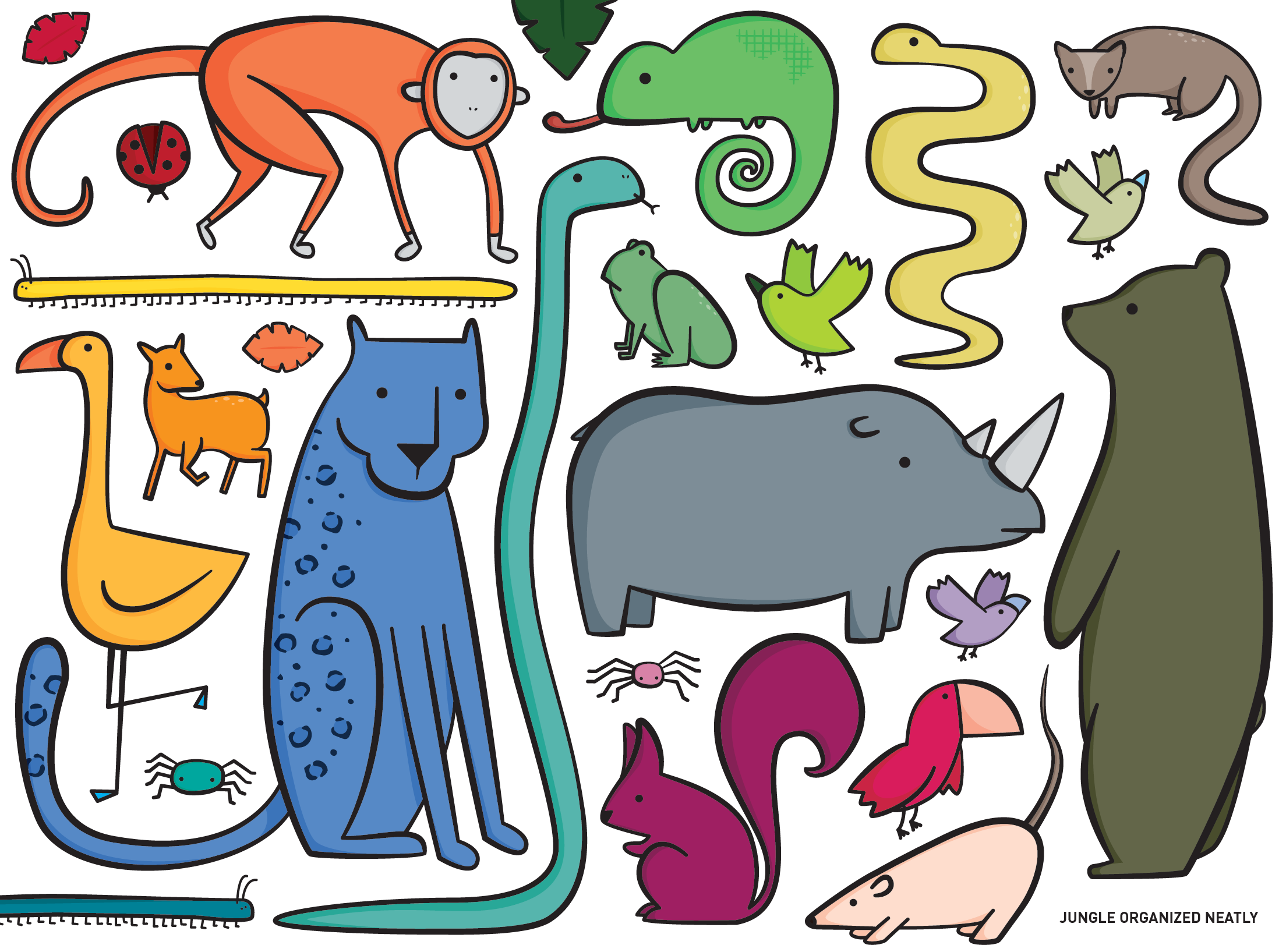
the jungle organised neatly

Earlier this year I was asked by fellow collective member (and amazing photographer/videographer) Camille Santiago to be a part of her exhibition Jungle Heart – the cherry on top of her admirable year of fundraising for the WWF and conservation in Borneo. The Jungle Heart event was held at Southside Tea Room in Brisbane last night and raised a significant chunk of money for charity.


Artists were briefed to make pieces that were relevant to the jungle / Borneo / orangutans /conservation.

Lately I have been a bit obsessed with the tumblr, things organised neatly, so I decided to make something along these lines and draw a few of the really cool animals from the Borneo jungle organised neatly.

I am really happy with my piece and was even happier when an old friend showed up to the exhibition to buy it after seeing it on Instagram (because she is obsessed with monkeys and loved the monkey!). Thanks Kay ❤

April 18, 2014

we heart bleach

For the we heart collectives lasted exhibition, we were invited by Bleach Festival to contribute to the 2014 festival that celebrates all things Gold Coast and its beach life / culture. The theme for the exhibition was "we heart words" with local creative writers submitting short stories about the Gold Coast, of which we all picked one and created a piece inspired by that, also drawing off our own love of the city that most of us grew up in, all went to uni in and some still live in.

Although at the time I created this piece I was sitting in an airbnb apartment in downtown Stockholm with top temps of 5ÂșC, after just being in lapland for 10 days for the most winter-of-winter adventures: dog sledding, I still embraced all things I love about living on the Gold Coast and its relaxed beach culture. The final print was A1 and coming home to it sitting in my room (after having missed the exhibition due to being in Oslo) I am in love with it still.

flying money


In January I created the branding for The Third Pocket, a superannuation startup that aims to make sense of super for those under 35 – a group disconnected from their super and desperately needing to be engaged.

I wanted to kept the focus of the brand on being engaging, but not in a traditional finance way that is more in line with slick business. Instead it's what I like to think of as new-corporate – professional, with a human element (a people-work-here-not-machines kind of mindset).

I kept hints light with a illustrated focus and flat fun colours and elements that could never be taken too seriously, like flying money. This is one of my most favourite brand designs I have done in a long time.


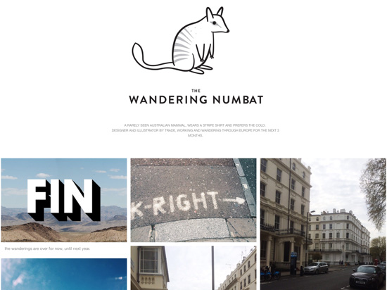
wandering numbat

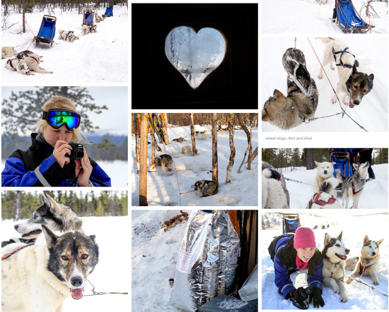
If you are a regular visitor to either this blog or my website, you may have noticed a distinct lack of activity for quite a few months. Well, the reason for this is that I was wandering around the Nordic regions of Europe for that time, and although working whilst travelling, many things like keeping my folio up to date got pushed aside in favour of exploring. On the upside I did keep a tumblr whilst away - mainly so that my mum knew I was still alive - but also to remember the cool things I saw and did over the months. You can retrospectively follow my journey at wandering-numbat.tumblr.com


I saw and did some extra cool things during my trip, but for those who couldn't be bothered scrolling through 1,434 photos, the highlights were definitely a 10 day drive around the ring road of Iceland, and an 8 day dog sledding trip in Swedish Lapland.


Who is the numbat, I am the numbat. lol. I named the tumblr this because I have a ridiculous collection of striped shirts and besides this trip, am rarely seen by friends (or anyone besides those I live with) due to my self imposed work schedule. With these characteristics loosely applied to an animal, preferably Australian, the result was a numbat - a wandering one.

Ohau

A great friend of mine from uni, Andrea, got married at the end of december and as always there was the challenge of what to get her as a gift. I really wanted to make her something, as handmade gifts are so much more appreciated (and remembered) than yet another vase or appliance. She had mentioned that she was going to NZ south island for her honeymoon - a place already nestled in my heart after going a few times in 2013 - so I decided to draw her and her future husband in my favourite place: near Lake Ohau, NZ and showing the Ohau Mountain Range (a distinctive range I woke up staring at for 4 weeks of 2013).

She loved the gift and much to my delight she ended up going to Lake Ohau on her honeymoon - more of a coincidence than it seems with Ohau being well off the tourist trail in the remote area of the Mackenzie basin in central South Island.

December 01, 2013

dogify

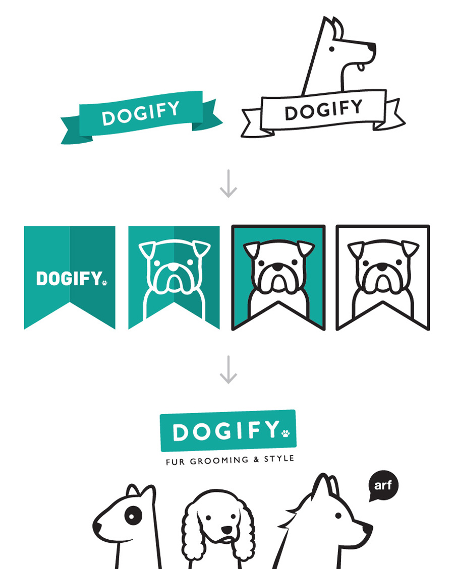
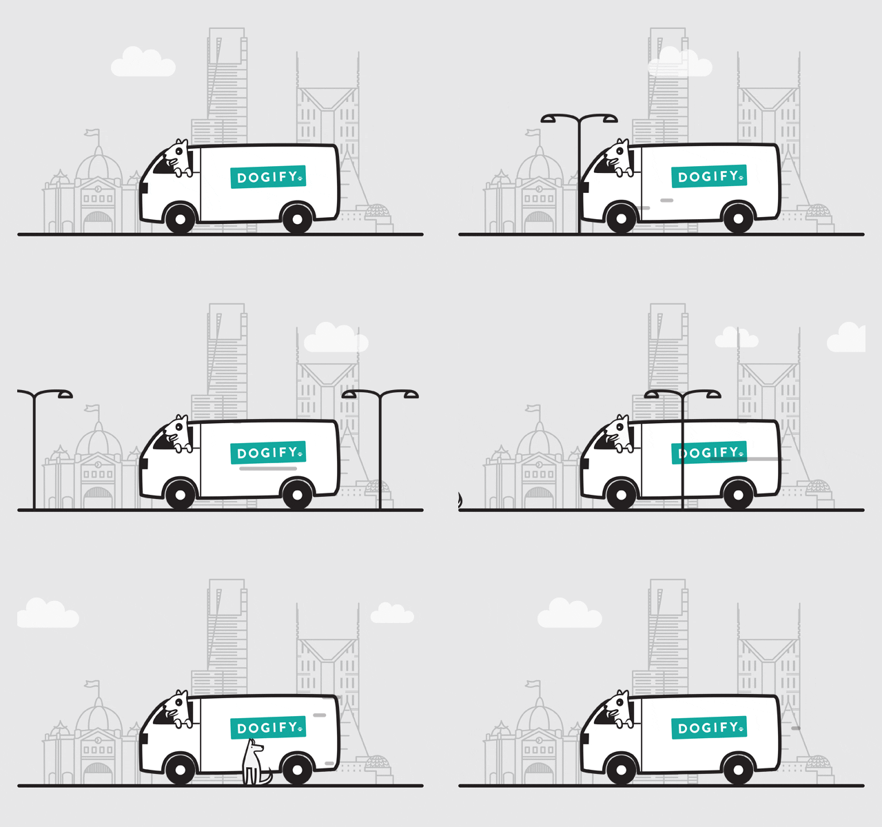
A large part of this year has been spent working on Dogify – a new Melbourne based webstore for dog products and dog grooming. I have had so much fun creating everything from branding and website design to animated gifs (something I haven't made since this old old project I did in high school).


Above you can see the logo progression from early versions to the final one. I still totally love the first two, but in true graphic design style, the one you really love never gets picked. You can see the full write up of the project and a heap of images of the work over on my portfolio.

September 29, 2013

the mother of all updates

Over the past few weekends I have pushed myself to update my folio after realising that it had been months since my previous one. With almost every major job I did this year missing from my folio, I figured it was time to sort it out.

When putting it all in a little montage, it looks heavy on the illustration side, but there are some really fun projects in there including more christmas cards for the RPSCA (and gift wrap!)There are still quite a few projects to add, but head on over to my folio and check it all out

May 04, 2013

the gift of chocolate

This year, Pana Chocolate decided to add special occasion gift boxes to their range. The series started with Happy Easter and I love you mum (available to buy on their website), with more occasions to be added to the range later on. The gift box was based off a large version of the original 45g bar, with a brown box and bright coloured sleeve. It also included a gift card that tucked into the sleeve on the front.

The box was foiled with silver and embossed. As with all Pana Chocolate packaging, the box was printed with soy based pantone inks on 100% recycled board and used recyclable foil.

March 12, 2013

octopus dumpling

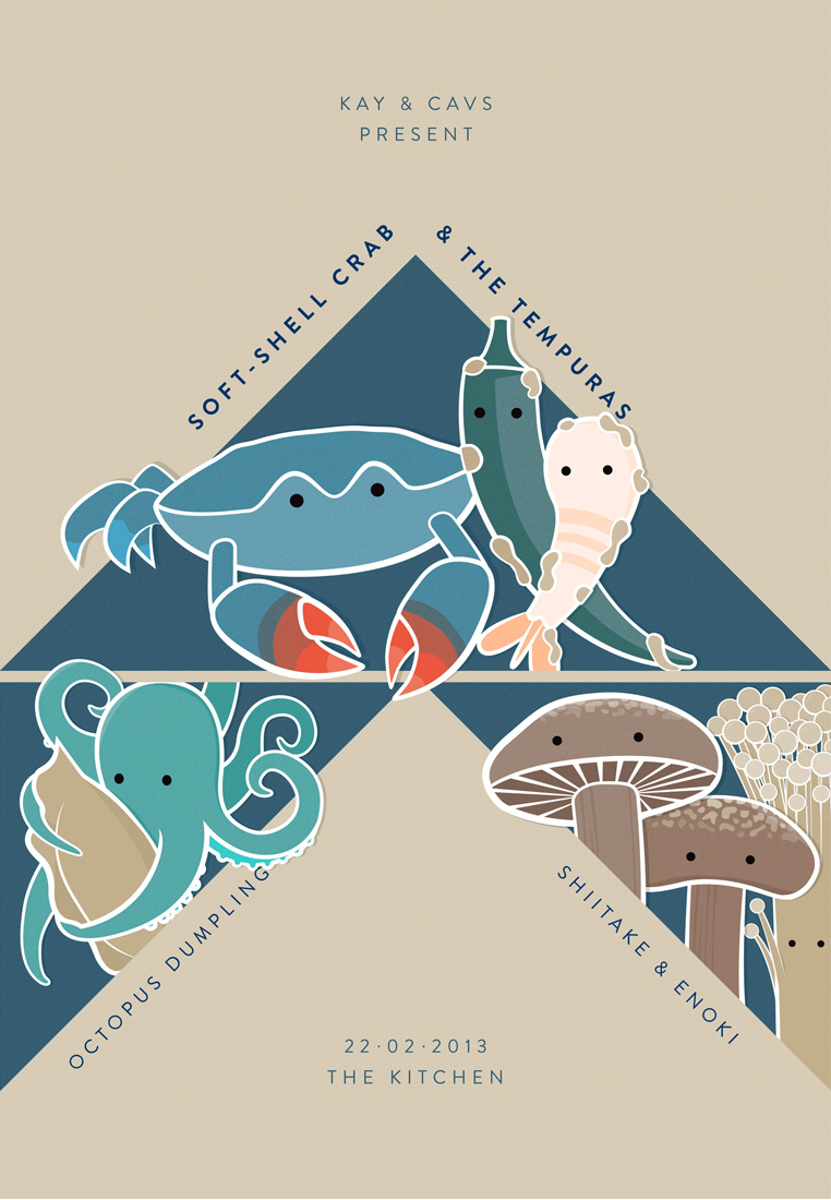
For a music loving foodie friends recent birthday, I decided to make her a present rather than buy one. I thought it would be really fun to do a band poster where the stars are food and side-dishes instead of bands.

Given her love for Japanese food (who could blame her, its amazing), I went with some tasty and (in the end) cute japanese dishes – Soft shell crab and the Tempuras, Octopus Dumplings with Shiitake and enoki mushrooms. I was so happy with the outcome and judging by her squealing drunk hug, I think she loved it too.

March 10, 2013

mouse clicker

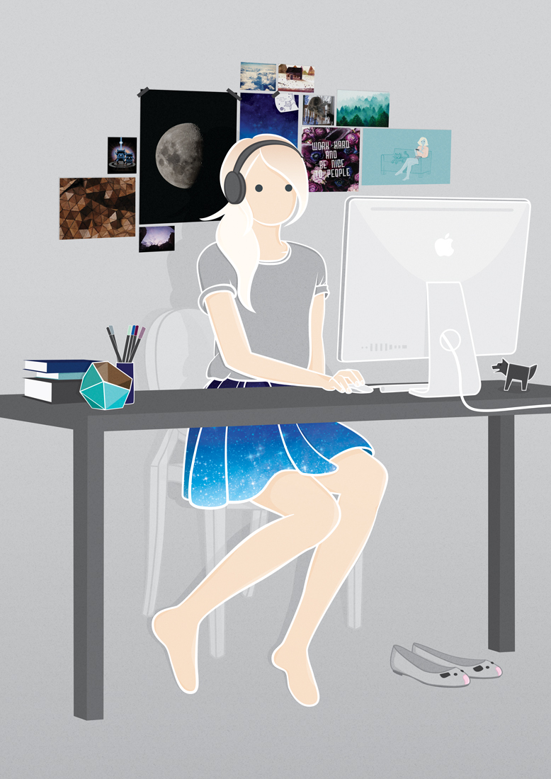
For the recent we heart collective exhibition we heart music, I decided to knockdown two projects with one drawing – not only an artwork for the exhibit, but also a new drawing for my about page.

I drew myself in my dream studio clicking my mouse endlessly, surrounding by things I love – forests, deer, tron cats, textures, interesting objects, the most awesome space skirt I wish existed and of course a pair of mouse shoes.

Music in my workspace is a powerful thing. When work presents a problem, music is always the answer. Got a bad case of 'blank canvas'? Time for guilty-pleasure 80's synth-pop. Facing a day of drawing fiddly-bits? Queue up that endless folky-but-not-folk playlist and zone out. Got a client demanding 'like this but fresh'? Find whatever the hipsters are listening to this week and the freshness will take care of itself. I've never come across a work-related problem that music can't fix, but if I do, there's always that mysterious 'work emergencies only' playlist.

March 06, 2013

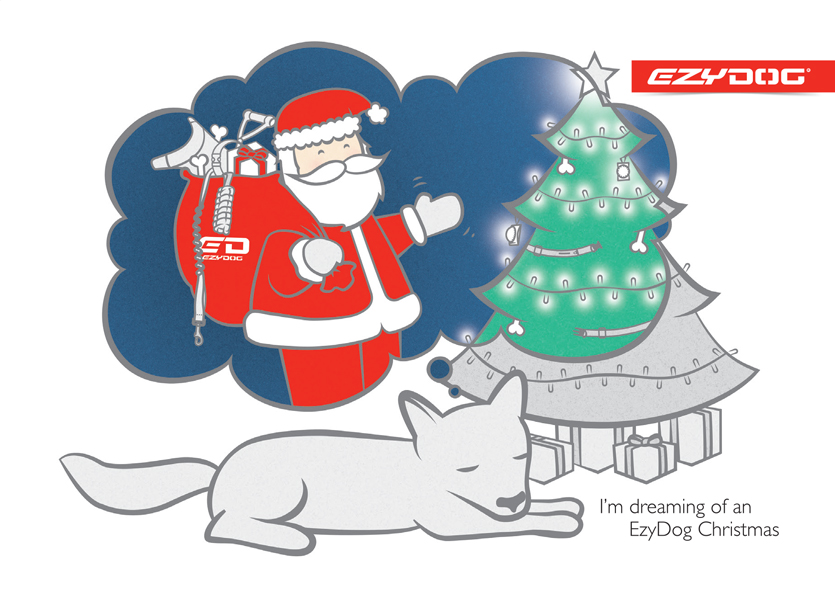
I'm dreaming of an EzyDog christmas

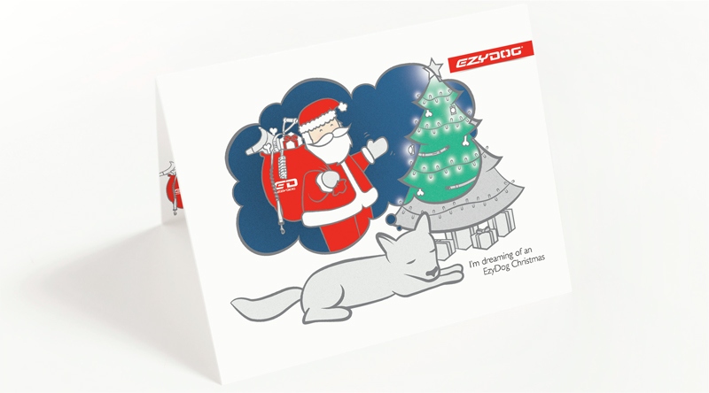
I was really excited when EzyDog asked me to create a christmas card for them last year. My mind boggled with ideas, but I decided I really wanted to focus on the (super cute) idea that a dog would be looking forward to christmas. Of course there needed to be a marketing angle in there, so I came up with the theme of "I'm dreaming of an EzyDog christmas", whilst humming bing crosby in my head. After the worst pitch sketch of all time, the idea was approved and I got onto the drawing.

The idea is that the dog is dreaming of the night before christmas, when the EzyDog santa comes into the room with his sack full of the brands goodies. I kept all things branded in the dream bubble and only coloured those section to draw the focus.

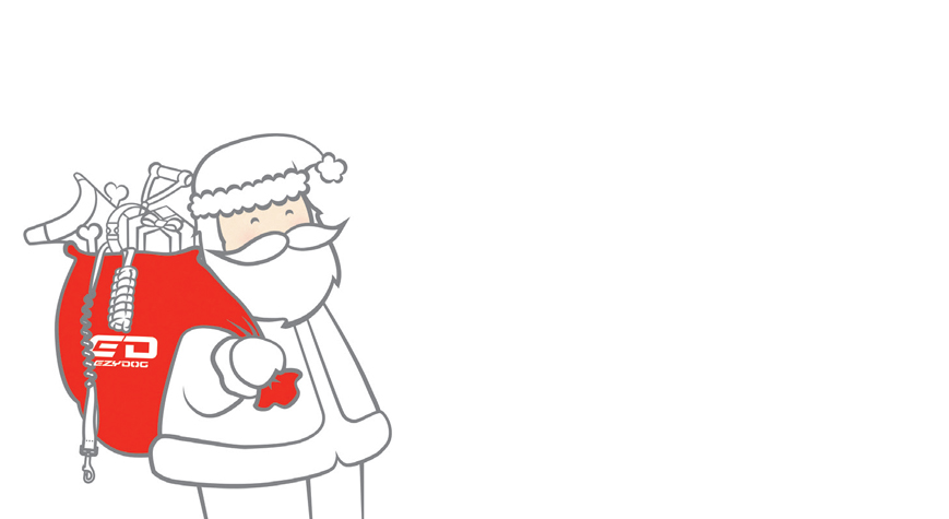
... and then Santa again on the inside of the card.

November 10, 2012

cat shrine

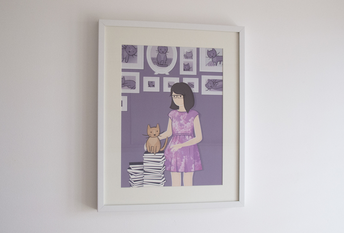
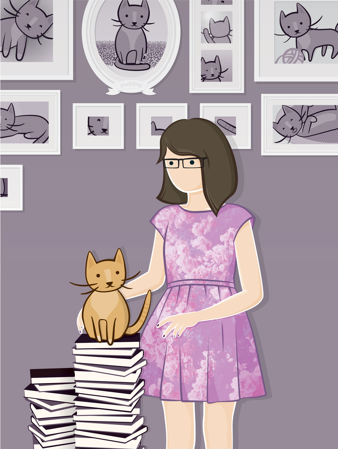
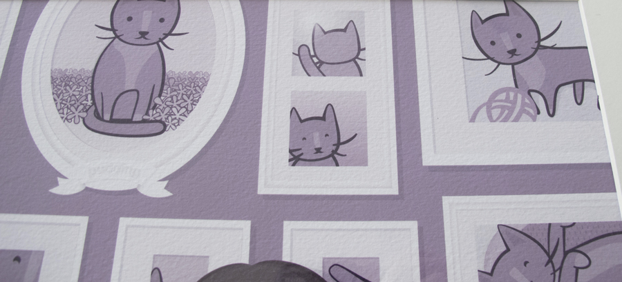
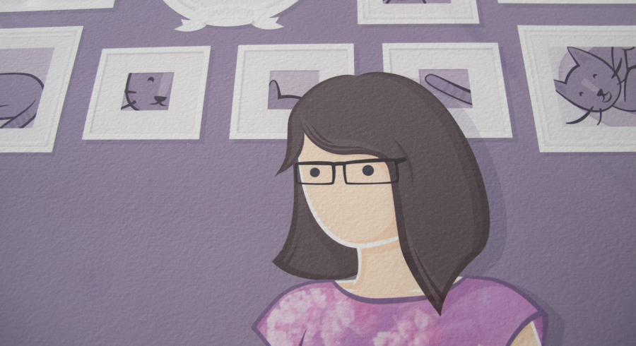
A while ago I promised my friend Ashleigh that I would draw her something for her birthday. She recently got a kitten called Pudding (it was born on christmas day – cute) which has become the centre of her world. It seemed obvious to draw Ash's pudding devotion into a kitty shrine.

drawn in illustrator, printed on a textured coated stock and framed. Finished size, 300 x 400mm. I also included Ash's other favourite things – floral dresses, the colour lavender, lots of cats and her signature bob hairstyle. I'm pretty sure she loved it ;)

September 02, 2012

dogs dogs dogs

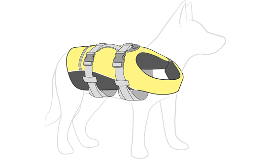
A recent project involved drawing lots of dogs wearing dog products. What began as repackaging an entire line of dog products for local manufacturer EzyDog, soon turned into an illustration exercise when I drew an illustration of a dog lifejacket to go onto a swing tag.


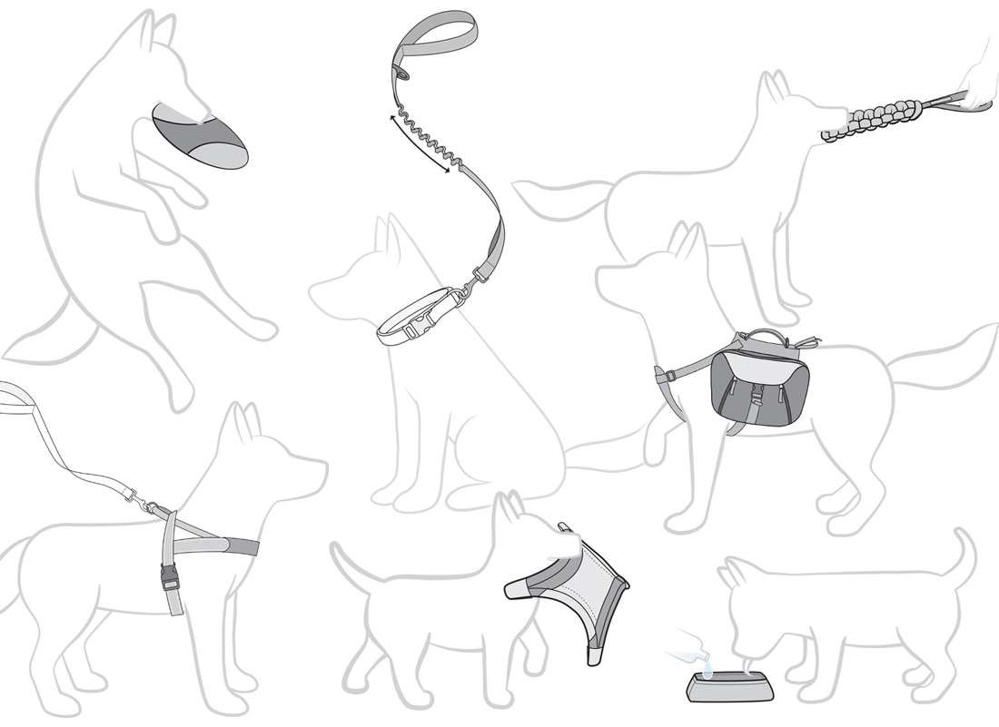
The clients loved the drawing and how clearly it communicated their product, so they quickly asked for ALL of their products to have a similar drawing made :) The client asked that all the products be drawn on the same breed of dog - an iconic australian blue healer style dog with pointy ears - with the intention that it become a sort of mascot for the brand. So I drew a decent selection of drawings of the same dog and then also a smaller puppy version to showcase their products aimed at small dogs.


At close to 30 drawings it was an interesting challenge to draw cute dogs (not so hard) with sufficient detail in the products to communicate all the features.
The drawings will of course be used on the packaging line I am creating but also for the companies soon to be launched website.

August 11, 2012

the do-over


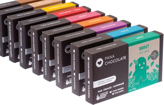
Due to a mountain of complicated legal reasons, I recently converted all the things I had previously done for Conscious Chocolate over to be Pana Chocolate. It was the clients intention to keep everything as similar as possible to the previous look. The project was huge and involved redoing branding, website, the entire range of chocolate boxes (now 9 flavours), the distribution boxes, stationery and countless other smaller jobs - all in the space of a couple of weeks!

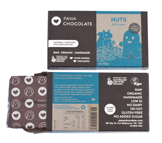
During previous revisions, some things on the box were adjusted to speed up packaging time and reduce cost compared to the first version which I talked about on the blog. The box also became more eco-friendly with 100% recycled stock, recycled foil and soy based pantone inks. The overall effect is a very rough, organic look - which the client (and their customers) love.


The launch of the new brand also coincided with the launch of three new flavours (cinnamon, eighty and rose), which expanded the colour range to include a pink and purple. At the beginning of the project, the future flavour range was divided up to allocate all flavours a colour - together they would make a full rainbow of flavours. It is nice to see the range coming together with more colours.

June 21, 2012

surprise... its a spot UV bunny


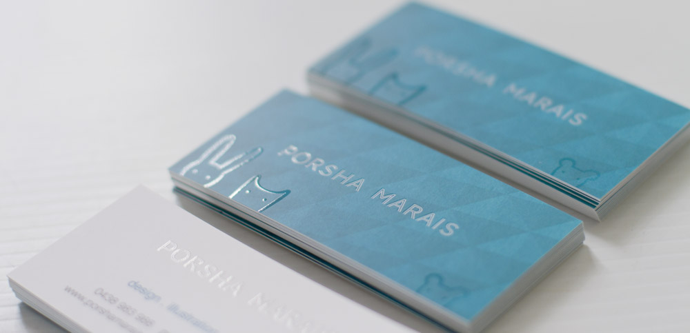
Seeing as I had changed almost everything else from my previous brown paper identity, I figured it was time to do some new business cards to match the teal, patterned thing I have.

Business cards can be such a dry, boring item and I really wanted to do something fun. On a whim I drew some little animals and made them spot UV ... success. A card that seems straight-laced, them bam, cute animals hiding in the matte cello.
June 09, 2012

drawing in real life

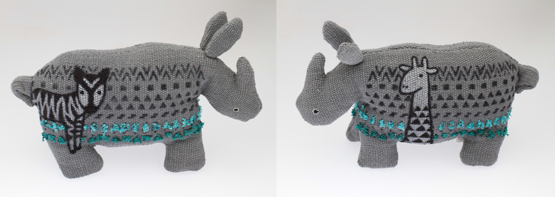
I was recently asked to illustrate a toy rhino to raise money for the seven-women charity. I had no hesitation about joining the project, but once I got my rhino I realised that I would not be able to use my usual processes to make the outcome - i.e. no computer. Panic stations! - you see I don't usually draw without a computer - seriously, never. I was stressed that I would stuff things up and then I couldn't undo it and my rhino would look awful and there would be nothing I could do about it. (My end consensus is that I should really try to draw in real life more often).


In the end I went with pattens and then drew patterned animals trying to hide in the patterns. I decided to alter the traditional patterns of the zebra and giraffe to make them more interesting and a bit quirky. I was pretty chuffed with the end result (and the fact I didn't stuff it up). Apparently another artist bought my toy rhino, which is nice to hear.


May 07, 2012

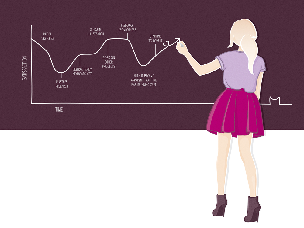
the cycle of satisfaction ... how every project goes

The most recent exhibition from the We Heart Collective was We Heart Numbers, hosted by the Rabbit Hole Gallery / Ideation Cafe in West End, Brisbane.


With a theme as open as "numbers", I went through many different ideas before deciding to go a bit meta and make a graph about the satisfaction of an idea over time in a typical project. Of course I couldn't just draw a graph, so there was a lady involved as well ;)


I was really pleased to overhear a few comments from strangers on opening night along the lines of "hey, this is just like us!" Its great to know your work can have universal appeal.

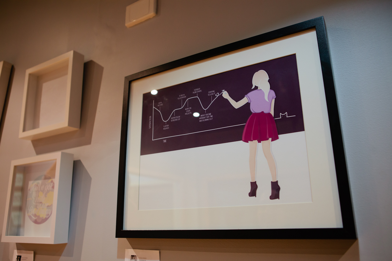
The illustration was printed on a textured stock and framed. For once I did something quite big, this time the print was A3 size.


Above photo by fellow collective member and talented photographer, Camille Santiago.

The exhibition will be on display until the 19th May, so check it out if you get a chance.

May 05, 2012

informative diagrams

As well as designing the Conscious Chocolate packaging, I also created their website which functions as an online store and a source of information on their product. The company's ethos is one of honesty and health, so when I suggested they have a diagram explaining how their chocolate is made, they were thrilled.

I love making information clearer to understand and illustrated diagrams do this so easily when well made. I love how this particular diagram turned out :)