Showing posts with label design. Show all posts

April 18, 2014

flying money


In January I created the branding for The Third Pocket, a superannuation startup that aims to make sense of super for those under 35 – a group disconnected from their super and desperately needing to be engaged.

I wanted to kept the focus of the brand on being engaging, but not in a traditional finance way that is more in line with slick business. Instead it's what I like to think of as new-corporate – professional, with a human element (a people-work-here-not-machines kind of mindset).

I kept hints light with a illustrated focus and flat fun colours and elements that could never be taken too seriously, like flying money. This is one of my most favourite brand designs I have done in a long time.


December 01, 2013

dogify

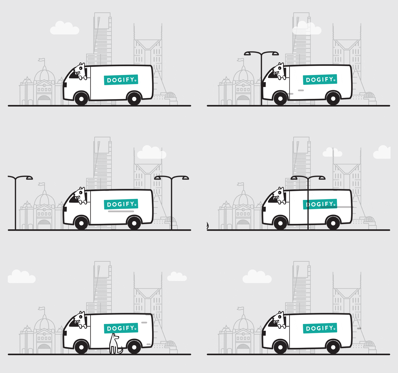
A large part of this year has been spent working on Dogify – a new Melbourne based webstore for dog products and dog grooming. I have had so much fun creating everything from branding and website design to animated gifs (something I haven't made since this old old project I did in high school).


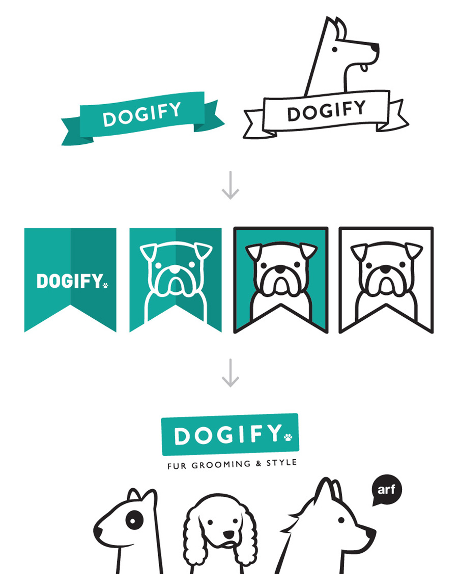
Above you can see the logo progression from early versions to the final one. I still totally love the first two, but in true graphic design style, the one you really love never gets picked. You can see the full write up of the project and a heap of images of the work over on my portfolio.

September 29, 2013

the mother of all updates

Over the past few weekends I have pushed myself to update my folio after realising that it had been months since my previous one. With almost every major job I did this year missing from my folio, I figured it was time to sort it out.

When putting it all in a little montage, it looks heavy on the illustration side, but there are some really fun projects in there including more christmas cards for the RPSCA (and gift wrap!)There are still quite a few projects to add, but head on over to my folio and check it all out

May 04, 2013

the gift of chocolate

This year, Pana Chocolate decided to add special occasion gift boxes to their range. The series started with Happy Easter and I love you mum (available to buy on their website), with more occasions to be added to the range later on. The gift box was based off a large version of the original 45g bar, with a brown box and bright coloured sleeve. It also included a gift card that tucked into the sleeve on the front.

The box was foiled with silver and embossed. As with all Pana Chocolate packaging, the box was printed with soy based pantone inks on 100% recycled board and used recyclable foil.

March 12, 2013

octopus dumpling

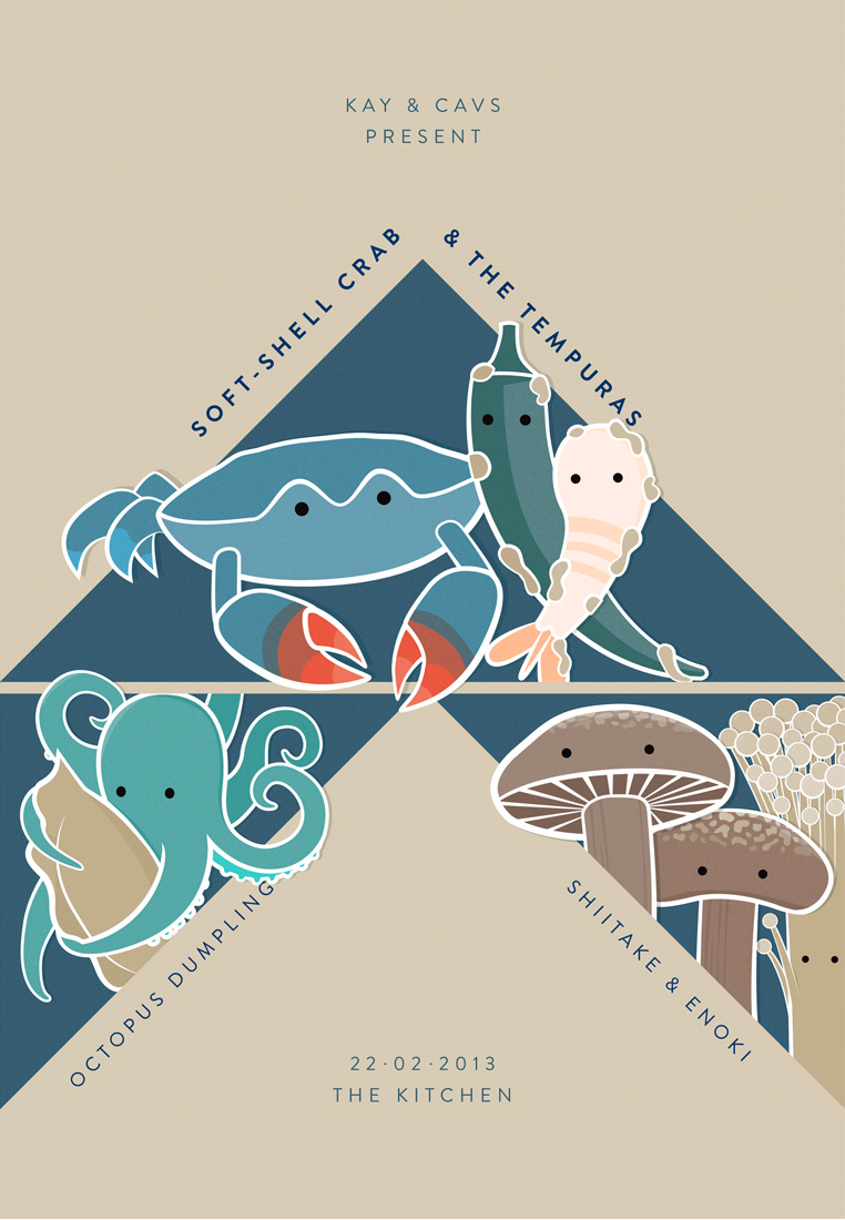
For a music loving foodie friends recent birthday, I decided to make her a present rather than buy one. I thought it would be really fun to do a band poster where the stars are food and side-dishes instead of bands.

Given her love for Japanese food (who could blame her, its amazing), I went with some tasty and (in the end) cute japanese dishes – Soft shell crab and the Tempuras, Octopus Dumplings with Shiitake and enoki mushrooms. I was so happy with the outcome and judging by her squealing drunk hug, I think she loved it too.

March 06, 2013

I'm dreaming of an EzyDog christmas

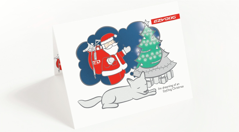
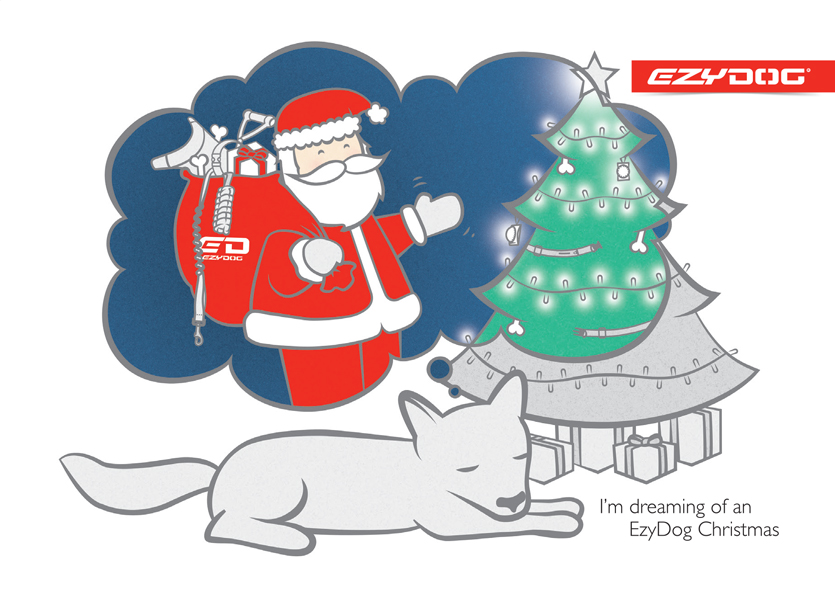
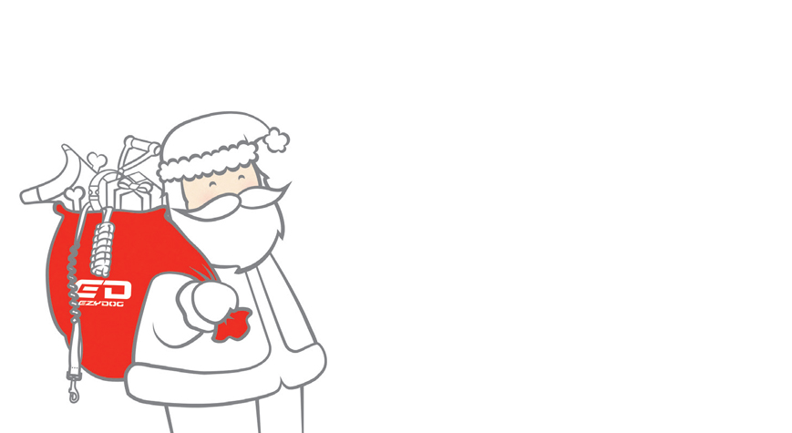
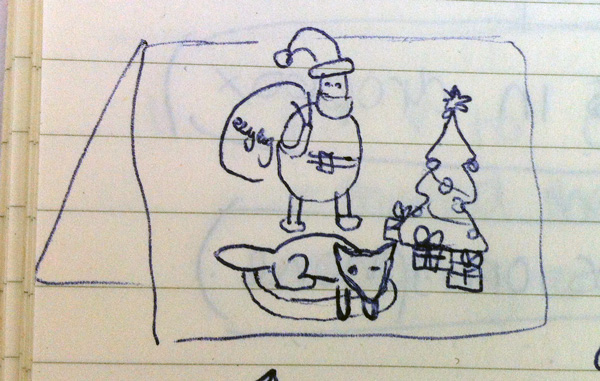
I was really excited when EzyDog asked me to create a christmas card for them last year. My mind boggled with ideas, but I decided I really wanted to focus on the (super cute) idea that a dog would be looking forward to christmas. Of course there needed to be a marketing angle in there, so I came up with the theme of "I'm dreaming of an EzyDog christmas", whilst humming bing crosby in my head. After the worst pitch sketch of all time, the idea was approved and I got onto the drawing.

The idea is that the dog is dreaming of the night before christmas, when the EzyDog santa comes into the room with his sack full of the brands goodies. I kept all things branded in the dream bubble and only coloured those section to draw the focus.

... and then Santa again on the inside of the card.

August 11, 2012

the do-over


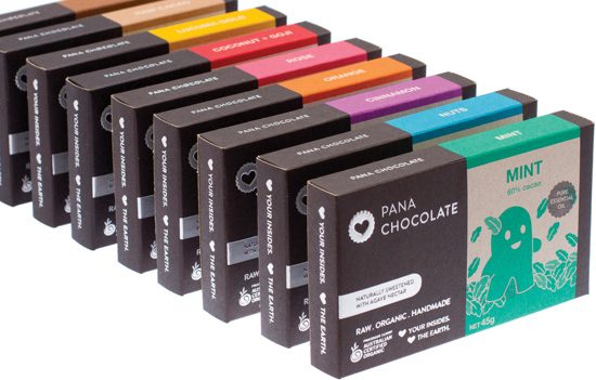
Due to a mountain of complicated legal reasons, I recently converted all the things I had previously done for Conscious Chocolate over to be Pana Chocolate. It was the clients intention to keep everything as similar as possible to the previous look. The project was huge and involved redoing branding, website, the entire range of chocolate boxes (now 9 flavours), the distribution boxes, stationery and countless other smaller jobs - all in the space of a couple of weeks!

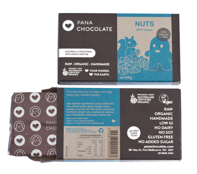
During previous revisions, some things on the box were adjusted to speed up packaging time and reduce cost compared to the first version which I talked about on the blog. The box also became more eco-friendly with 100% recycled stock, recycled foil and soy based pantone inks. The overall effect is a very rough, organic look - which the client (and their customers) love.


The launch of the new brand also coincided with the launch of three new flavours (cinnamon, eighty and rose), which expanded the colour range to include a pink and purple. At the beginning of the project, the future flavour range was divided up to allocate all flavours a colour - together they would make a full rainbow of flavours. It is nice to see the range coming together with more colours.

June 21, 2012

surprise... its a spot UV bunny


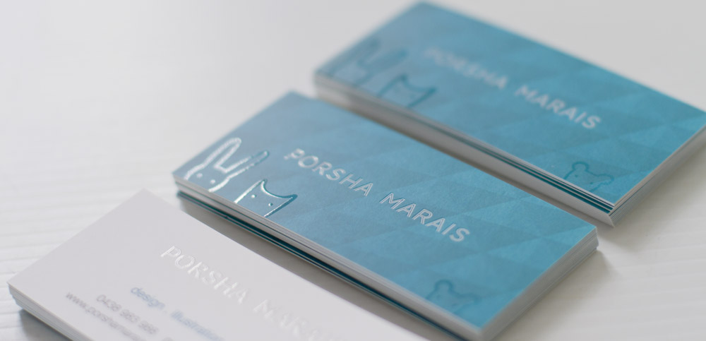
Seeing as I had changed almost everything else from my previous brown paper identity, I figured it was time to do some new business cards to match the teal, patterned thing I have.

Business cards can be such a dry, boring item and I really wanted to do something fun. On a whim I drew some little animals and made them spot UV ... success. A card that seems straight-laced, them bam, cute animals hiding in the matte cello.

May 05, 2012

informative diagrams

As well as designing the Conscious Chocolate packaging, I also created their website which functions as an online store and a source of information on their product. The company's ethos is one of honesty and health, so when I suggested they have a diagram explaining how their chocolate is made, they were thrilled.

I love making information clearer to understand and illustrated diagrams do this so easily when well made. I love how this particular diagram turned out :)


January 26, 2012

yes, I started a tumblr

For years I have had a folder on my desktop called "things I like". Everything goes in there and it is chaos. When I am looking for inspiration it is always my first port of call, but its lack of organisation always leaves me a little frustrated. I finally decided to do something about it :) I started a tumblr.
Feel free to look, feel free to not. I made it for my own reference, but if other people like it too - good stuff.

Whilst setting up the tumblr, I decided to try making some custom scripty type like my friend Ashleigh Brennan does. I loved making it and really want to make some more in the future.

October 30, 2011

have a purr-fect tail-wagging christmas


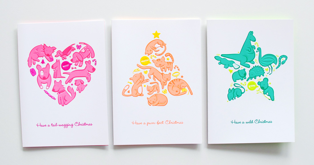
I was given an amazing opportunity this year to do concept, illustration and design for a set of christmas cards for the RSPCA.

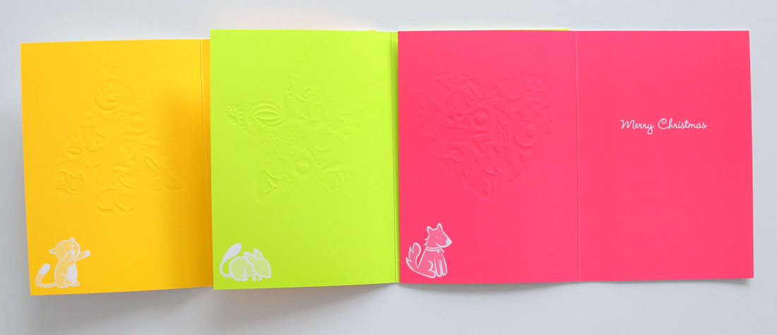
After looking at the other cards they have for sale, I decided they needed something bright and fun so I went with a colour palette of 6 pantone fluros. I made all custom illustrations to go with their brief of "a dog one, a cat one and a wildlife one", fitting the animals into christmas shapes. I also created custom embosses for all the designs to give a bit more texture to the animals.

The photos don't quite do the colours justice - they are so bright and lovely. I am so chuffed with the results.

The client loved them and from what I heard they are selling quite well (they have already ordered a reprint).
You can buy them here.

August 10, 2011

chocolate packaging


This year I have been working on a different kind of design project, but an exciting one for sure ... packaging.
I was contacted by a new organic, handmade chocolate brand launching in Australia and was tasked with designing everything for their brand. Obviously branding and websites are things I have done before, but packaging was a new frontier I had yet to venture into.

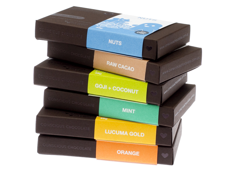
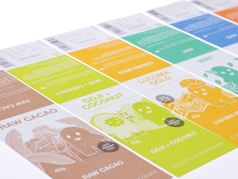
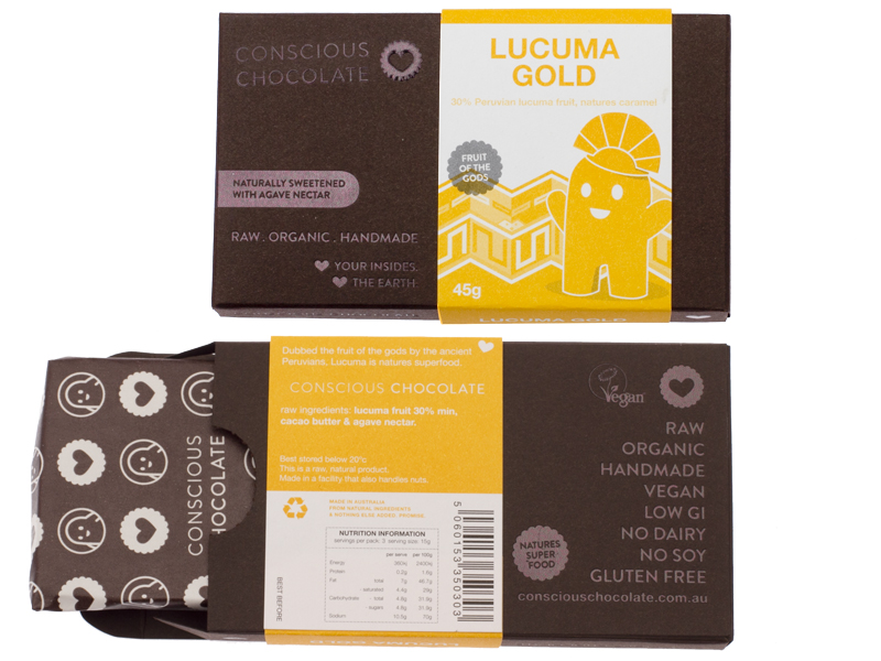
Conscious Chocolate is an Melbourne based raw, organic, handmade chocolate launching in 2011. The packaging had to convey the brands personality and appeal to their target market, whilst being a luxury organic product.

The packaging I created was a small box made of a rich dark brown Mohawk Concept Vellum with black foil and emboss as the only detail on it. All the flavour specific details are on the coloured sleeve, printed separately on white paper. Each flavour has a unique Pantone coloured strip with its own quirky character illustration representing the flavour inside. I also sourced out some paper coated foil wrapping to cover the chocolate on the inside.


May 04, 2011

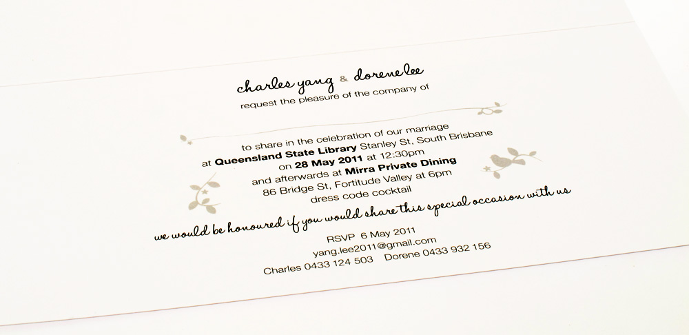
wedding invitations

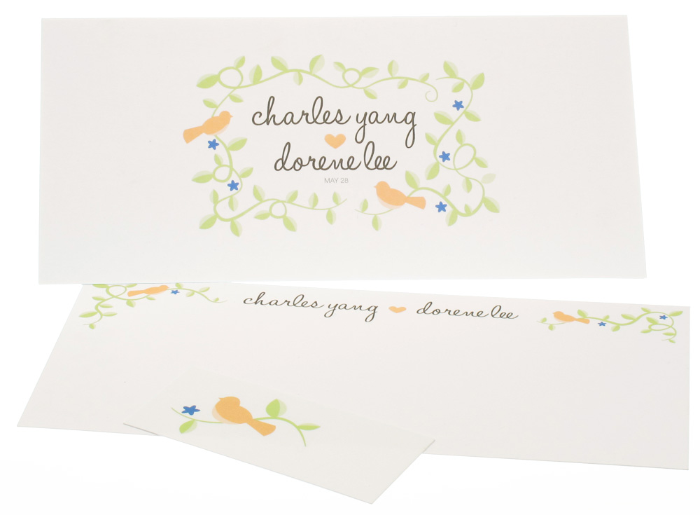
Some lovely friends of mine got engaged last year and they loved their engagment-gift-illustration so much that they asked me to do their wedding invites :)


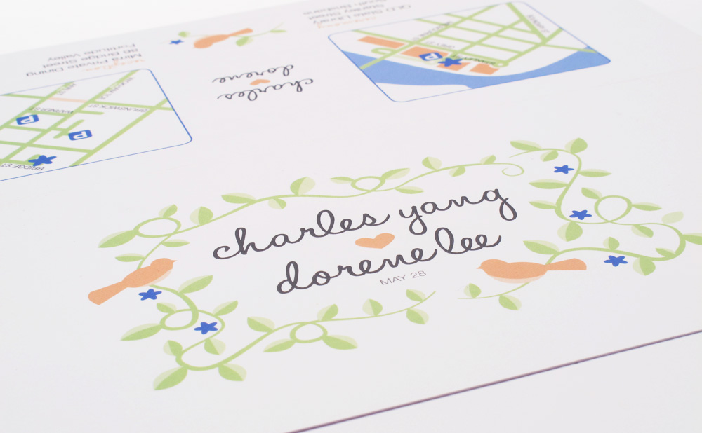
To match their ceremony and reception venues I made a few custom illustrations of vines and birds as well as some maps to help their guests find parking. The result reflects the couples personalities perfectly and of course they were really happy with their suite of wedding themed goodies.

The set included a DL folded landscape invitation, a thank you card and a gift tag for the favours. All were printed on a lovely thick white uncoated card and the names were embossed.

April 23, 2011

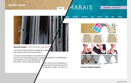
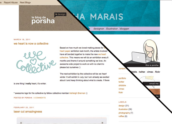
out with the old


realising it has been 2 years since my last branding / blog / website update, I decided to re-do it all with a new look. Out with the beige and orange and in with a new bright teal and lavender combo.


July 13, 2010

obsessed with the print

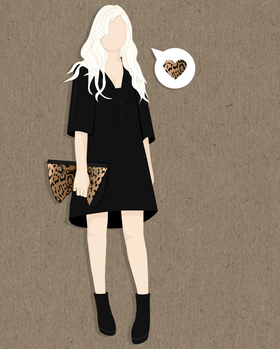
The illustration I did for my birthday invites, around the theme of blonde hair. Before I knew it, there was a giant leopard bag in there.
I love leopard print at the moment.

The invitation is A5 and I printed it on some textured card. Whilst planning my annual birthday dinner, I realised that none of my friends have blonde hair. So I bought them all a nice blonde wig. Now we can all go to dinner as blondes. Should be fun :)

July 09, 2010

ruby rabbit redux

Ruby rabbit, my dream client, is having so much success with her business that it came time to update her site to add new services. have a look at her beautiful new site

so much has changed, but I would like to point out a few things that are my favourite.

1. new watercolour background
After somebody mentioned that the old background looked a little like dried blood (!!!?), I figured I needed a new background. So in came brighter colours, more orange and hot pink and more brush style strokes. Gone are those crazy blood connections.

2. brighter images
As much as I love the light, pencil-style images on the old site, it made the overall appearance a bit flat. So in came a new style of images and some watercolour splashes into the background of the old images to give them some life.

3. social media integration
Being a virtual assistant, it was imperative that ruby rabbit was well connected in the virtual world. I added in a twitter feed on the home page, facebook and linkedin buttons in the footer of every page and an email subscription newsletter. Now she looks like she is in this decade :)

4. honourable mentions
A few things that aren't huge, but make the site a little more interesting. First, the new drop-down menus that allow the site to have more content without the world's longest menu. Second, the awesome wufoo contact enquiry form. If you have ever tried to make a decent emailer form, you will appreciate wufoo's magic service.

And finally...
The promotion of my design services (air punch ... woo!). It is nice to have somebody else finding work for you. Thanks Belinda :)

June 05, 2010

timelapse


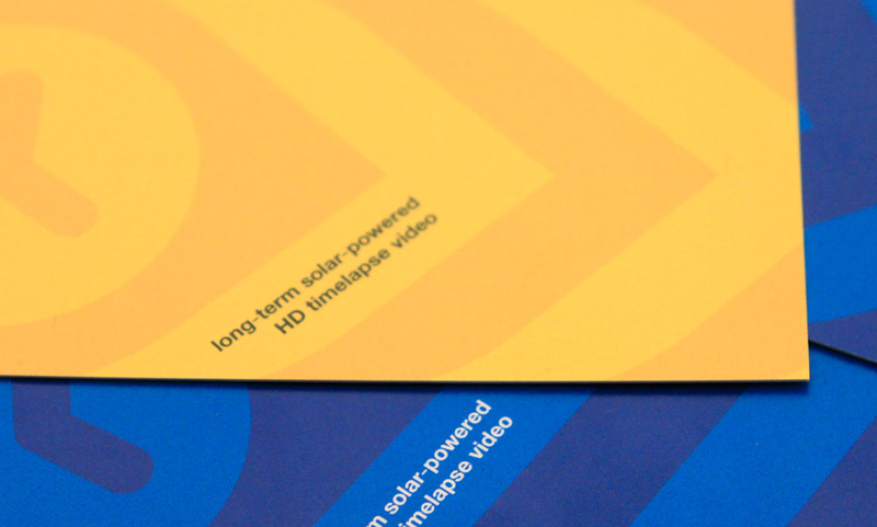
A recent family side-project is maketimelapse.com. My brother made the logo, but I did the business cards.
I decided on multiple back colours and people could pick which one they wanted (blue or yellow). They are printed on uncoated stock (so you can scribble on them), with a 4 colour back and a 1 colour front.
I love it when a card has a bright punchy back :)

June 03, 2010

thanks from the rabbit


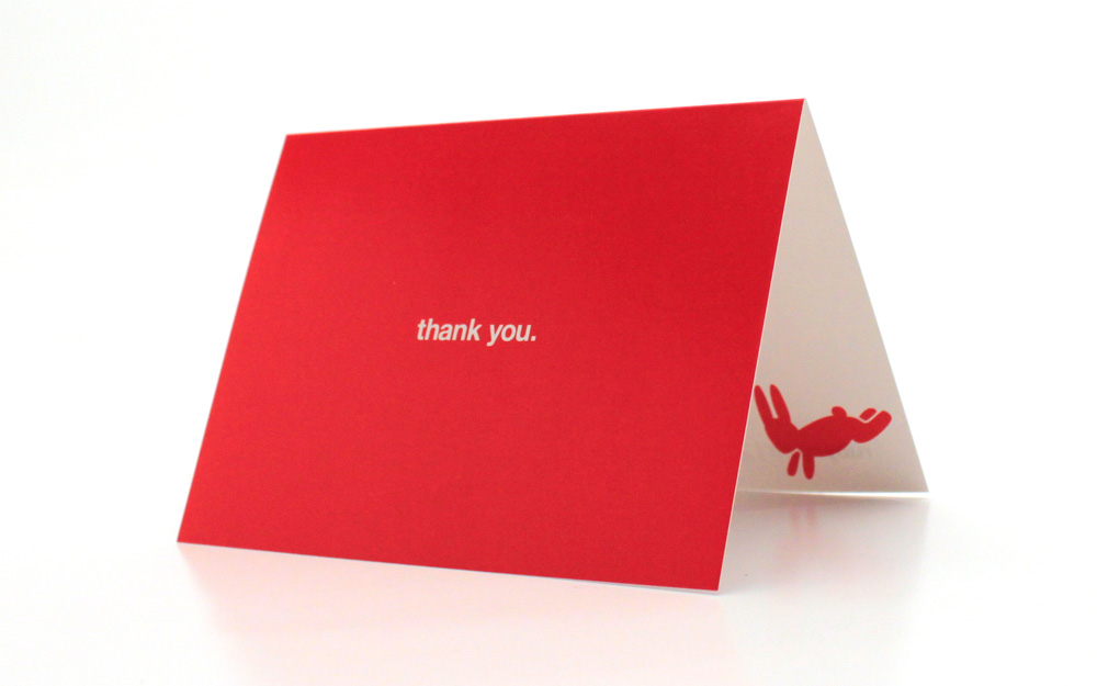
Ruby Rabbit wanted some simple cards to send as follow-ups to meetings/extensive phone calls/referrers/etc. The result is a nice little A6 card printed 2 colour with a sealer varnish on the outside. The client loves them - and her clients love receiving them.

June 02, 2010

cup type


As a designer, you often get asked to do really small jobs. Most of the time, these jobs aren't very exciting and therefore, don't make it onto the blog, as I figure I would bore the pants off you.
But here is one, that isn't quite as dull as the rest.
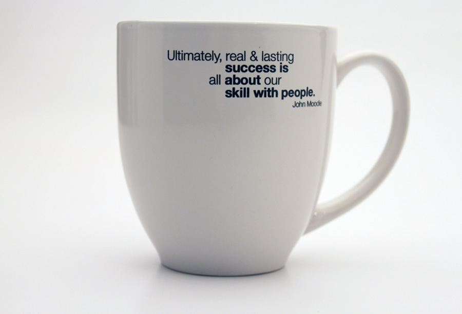
A client of ruby rabbit wanted one of his quotes typeset for printing on a mug that was a gift to his clients.

May 10, 2010

getting back into the swing


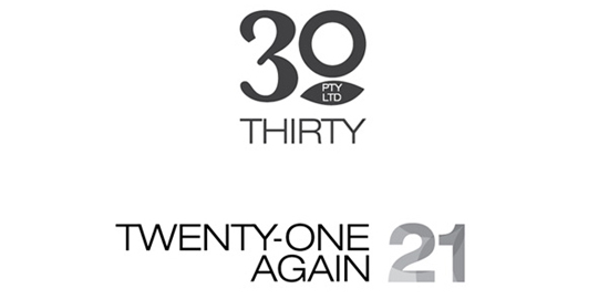
Some basic logos I did recently for some investment trusts/companies.
The client required them to be black&white and simple enough to print in the office (like template in a word doc style) . This seems to be the way everybody goes. Its a shame really. It lacks the ooomph that a proper offset printed letterhead has.
She loved the 21 again logo so much, I had to make a companion logo for 30 pty ltd to match. Another happy client.