something a bit different ...
a brand for a new client brings something new to my portfolio ... a bit of blue.
This logo is for medical minds, a new medical liaison business, for which I broke away from the beige palette that has dominated this year.
The client is super happy with his logo and a suite of stationery is in the pipeline for the next few weeks.
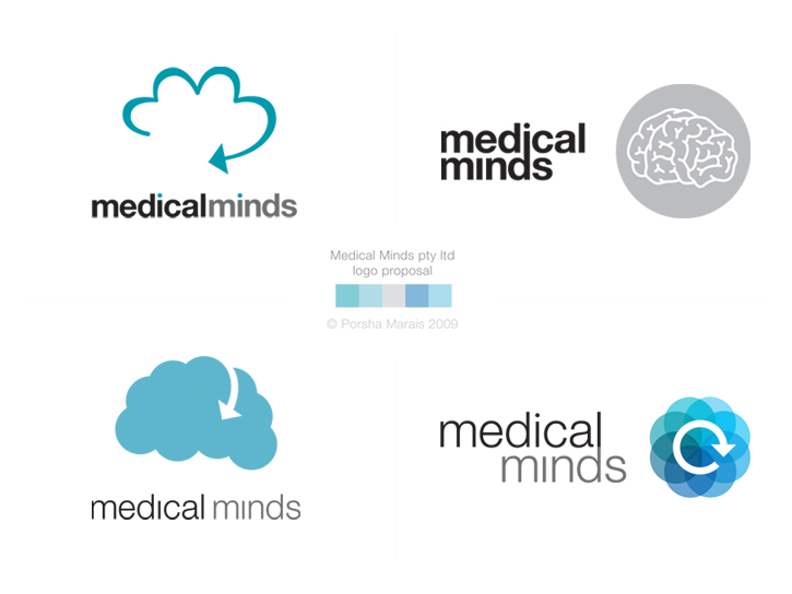
Below is the four initial logos proposed for the business. The final logo is an amalgamation of the top left and bottom right, which were the clients favourites.


4 comments:
I like :) That will look awesome printed - can't wait to see a hard copy
Bel
personally, I like the bottom left logo the best. The negative space really draws your attention, all the while making it more clear that it's a brain.
These are all fantastic! If I had been the client I would've had a very hard time choosing which one to go with. The grey brain is really interesting and has a modern twist on it but I think I prefer the first logo the best - the outline of the cloud and the little blue dot on the 'i' are lovely.
Great post thank youu
Post a Comment