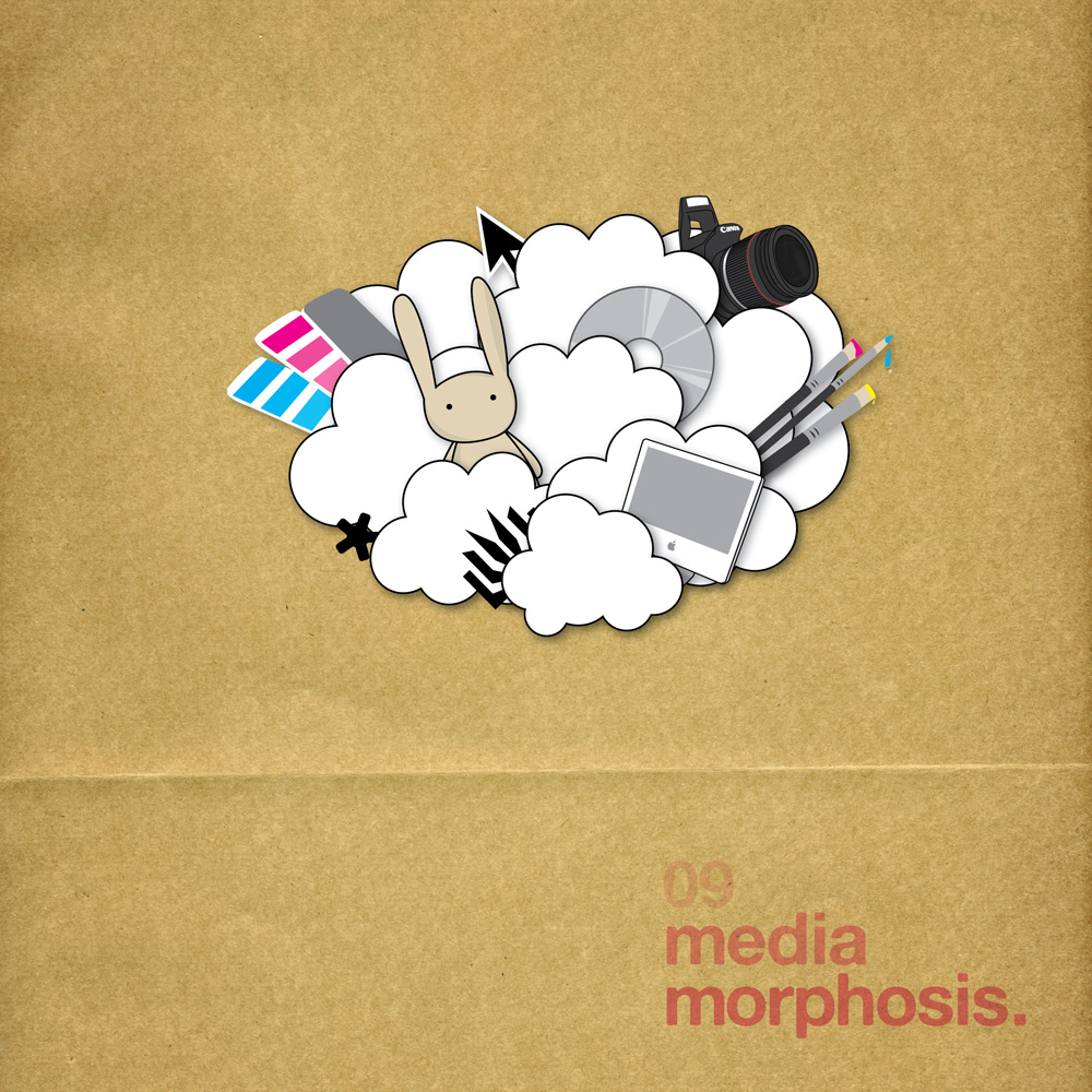
the cover
this semester I have spent every spare minute (outside of normal classes) designing the graduate catalogue for my design degree, which i was asked to do by the college director.
All the students collectively picked the name mediamorphosis for the graduating cohort (although no-one seems to want to take the credit for this rather ordinary name!)
So I needed to come up with an image that would work on the cover and all the other promo material for the exhibition in november.
Now the cover is done (and the catalogue is nearly in the same basket), here is the rough process and the final design.
-------------------
First I started with a really crap-tastic sketch of what I wanted to do.
In a nutshell - a bunch of objects that represent that different majors in the degree, exploding out in a poof of clouds.
After some terrible hand sketches, I realised I can't draw by hand and had to get onto the computer to draw this stuff.
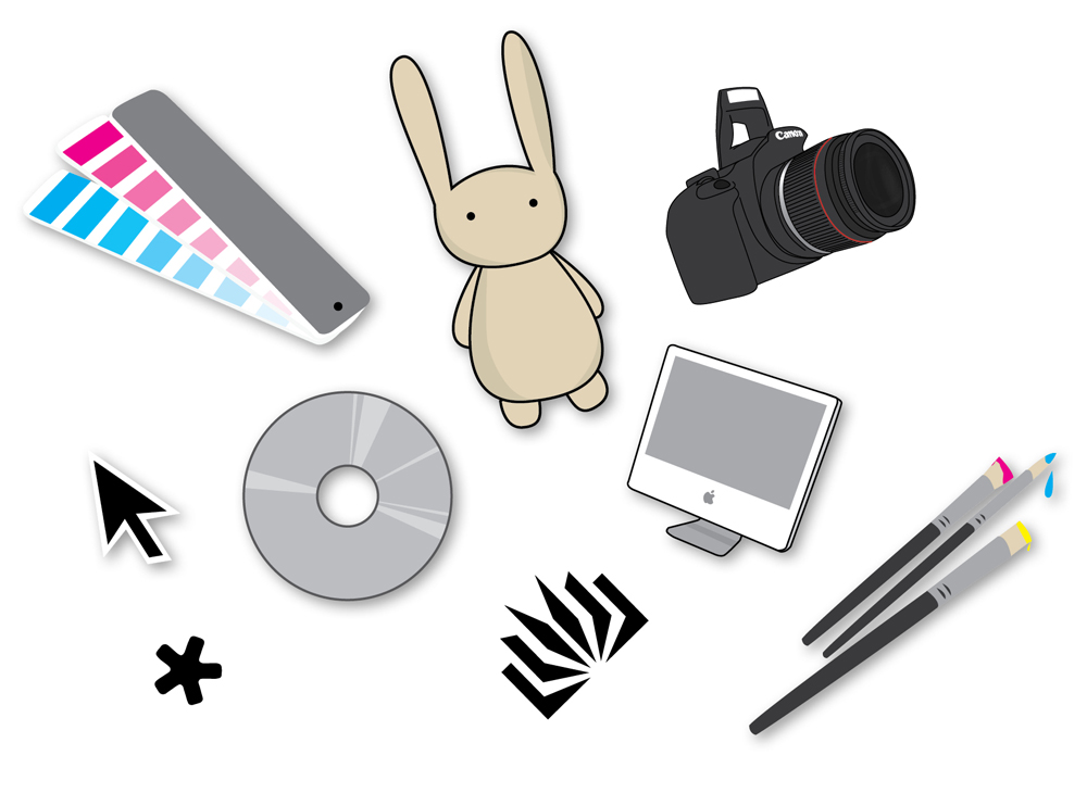
So there is an object for each major (3D design, digital design, ePhotojournalism, fine art, graphic design and honours) + the uni logo, and some spare things to balance everything out. Half of it is new stuff, and the other half is re-worked items out of the first year handbook I did last year.
Now I to arrange them in the clouds...
add the logo type ...
... and add in the scanned paper background. Et voila!
I am quite happy with the end result and am looking forward to seeing it in print with it's matt cello + UV spot varnish pattern (too hard to explain this now, you will have to wait and see!)


No comments:
Post a Comment